
Opinions on my advertisements

Thread Starter
|
FYL.
Joined: May 2006
Posts: 7,493
From: Pensacola, Florida
For my advertising strategy and tactics class we had to make two ads on products/brands we liked..these are the two I came up with, they'd both show up in a men's magazines, keep that in mind when viewing/reading them.
I'm posting them at 50% size, so you can see the whole thing. Just let me know what you think, I know they are good enough for the assignment, but I like hearing other people's opinions.
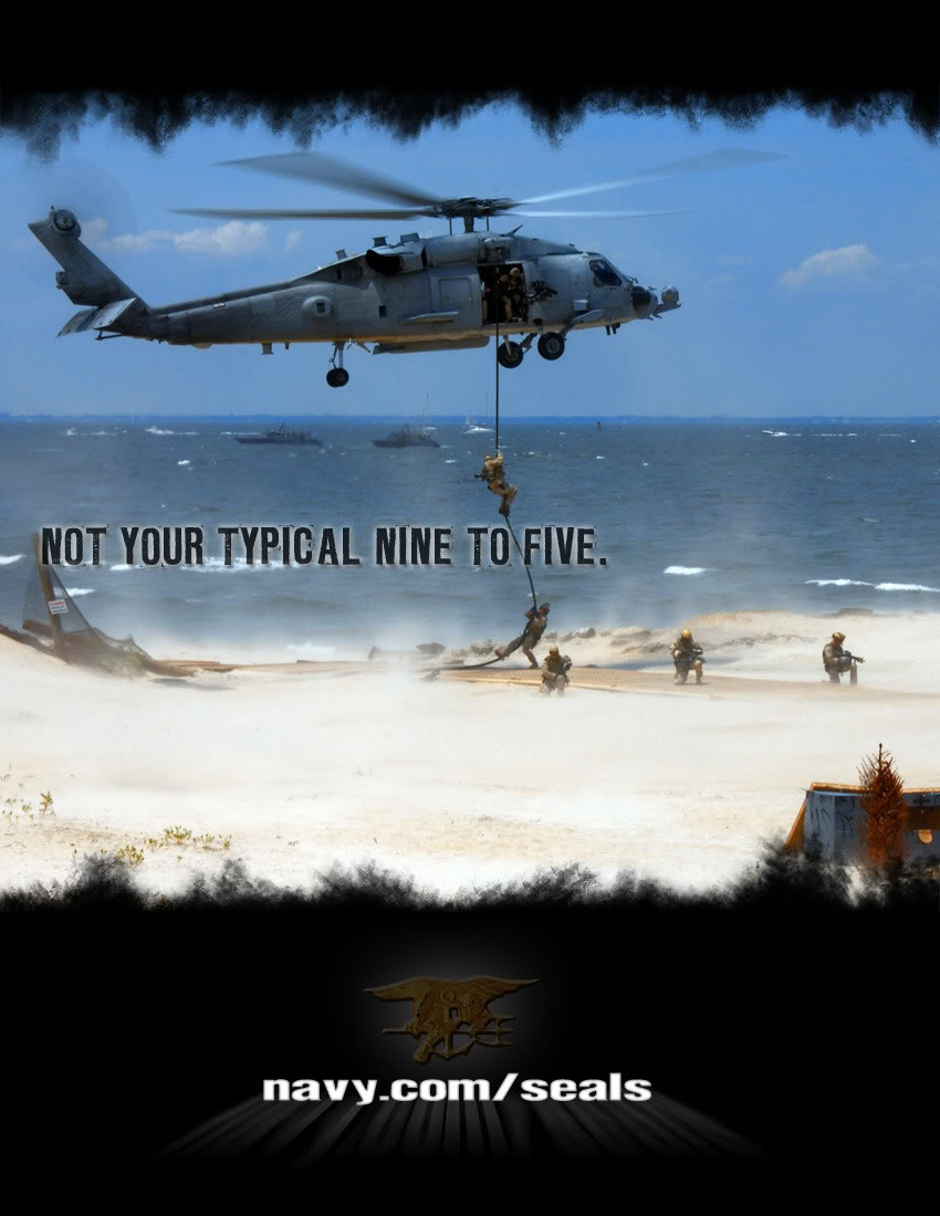
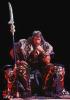
The Navy SEAL ad
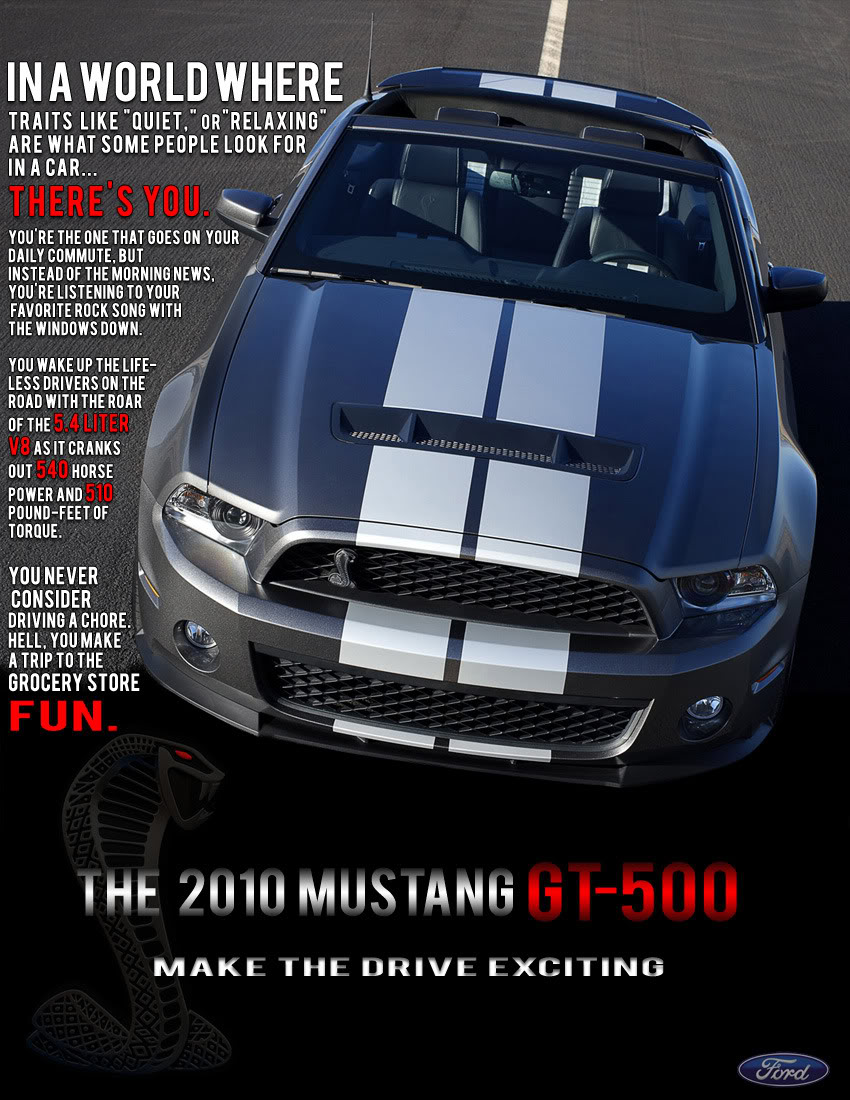
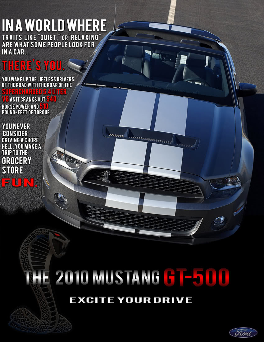
010 GT500 ad
I'm posting them at 50% size, so you can see the whole thing. Just let me know what you think, I know they are good enough for the assignment, but I like hearing other people's opinions.
The Navy SEAL ad
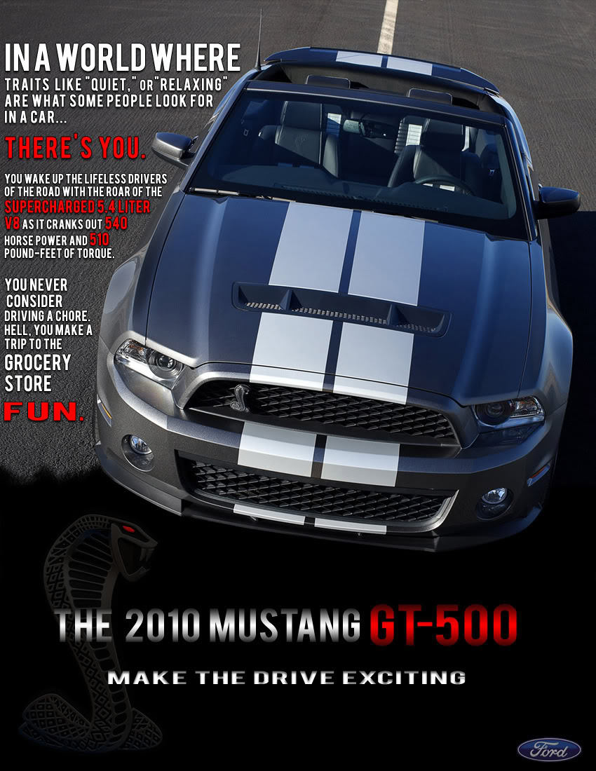
010 GT500 ad


your new ricer :P
Joined: Aug 2009
Posts: 119
From: orlando
for me in the mustang ad i would have like to have seen something more like "there are 2 types of drivers in the world. theres the ones that "quiet, relaxing, and peaceful" are ideal. then theres you. the one that jams out to their fave rock back with the sound of your 540hp out the exhuast of your 5.4l s/c v8, and the feeling of the 510 tq shove your head to the back of your seat. your the kinda driver that makes a trip to the grocery store fun."
of course reworded. but you get the idea
of course reworded. but you get the idea
Thread Starter
|
FYL.
Joined: May 2006
Posts: 7,493
From: Pensacola, Florida
That's basically what it says..lol. I changed up the text, deleted some redundancy and made the sizing vary..and got rid of the letters that overlapped the car, and made it less crammed. You might need to refresh to see it
your new ricer :P
Joined: Aug 2009
Posts: 119
From: orlando
yeah thats what i was going for, i was rewording it, to where it sounded like something i wouldn't mind putting the effort into reading if it was in a magazine...
but that aside i like it more now, but it lost some zest. idk what i'm saying, lol i'm gonna stop typing now. sry lol kthxbai
but that aside i like it more now, but it lost some zest. idk what i'm saying, lol i'm gonna stop typing now. sry lol kthxbai

Wowbagger hates me too!
Joined: Nov 2005
Posts: 9,865
From: Magrathea/California
Fabulous quality but the mustang ad is kinda busy. Delete 30% of the wording. I'd zap out the "You're the one... blah blah blah" section and leave the rest starting at "You wake up... blah blah".
VERY good work. Both were inspiring and made the subject look entirely more attractive than most of the ads I've seen for either. I think the SEAL ad was top shelf perfect.
VERY good work. Both were inspiring and made the subject look entirely more attractive than most of the ads I've seen for either. I think the SEAL ad was top shelf perfect.

What is best in life?
Joined: Jul 2007
Posts: 1,117
From: Gulf Breeze, Florida.
honestly I think you get rid of everything but the fun part. haha.
"With 540 horsepower, The 2010 Mustang GT500 makes a trip to the grocery store fun!"
Something like that would appeal to me.
"With 540 horsepower, The 2010 Mustang GT500 makes a trip to the grocery store fun!"
Something like that would appeal to me.

I'd Hit It
Joined: Sep 2006
Posts: 2,847
From: Texarkana, TX/Conway, AR
The Seals ad looks like it could be in a magazine tommorow. The Shelby ad is a bit to read and the picture is at an odd angle so I think it would be hard for someone to get a good representation of the car. Both are very good though.
Thread Starter
|
FYL.
Joined: May 2006
Posts: 7,493
From: Pensacola, Florida
Thanks guys! how about this line on the GT500, "Excite your drive" rather than "Make the drive exciting," it's more in your face, an uncommon structure and fewer words. Has a little sex appeal in there too.
4 point 6
Joined: Sep 2005
Posts: 3,347
From: Flagstaff, Az / Los Alamos, NM
very nice work, both ads are great in my book. The mustang ad looks long but it seriously takes like 5secs to read and is worth the read, I felt like I got some sort of exciting story out of it, and half made me want to go for drive right then and there.

Thread Starter
|
FYL.
Joined: May 2006
Posts: 7,493
From: Pensacola, Florida
Haha, you're the 3rd person to mention that. And the thing is, using "then there's you" doesn't flow with the rest of the paragraph, or how it starts "In a world of .... ,then there's you" would **** you up. Try reading it a loud and it'll make more sense, but yeah it could be confusing if you don't pick up on that first line.


Administrator
Joined: Sep 2004
Posts: 6,613
I think you did a nice job with both.
I work in Marketing and have an MBA. As part of my job, I have designed brochures etc... and have been through a pretty rigorous process to do them.
Here are a few comments that might help...maybe not now, but in the future.
One thing you always must consider, but you probably don't have access to are what is called "brand standards". If you have not been exposed to this yet in class, brand standards can be very specific and guide a designer. They address font issues, colors, logo placement, and all kinds of other things that you might be surprised to hear. No matter how good an ad idea is, if it does not meet brand standards, it will not run.
The second point is that they need to pass regulatory. This means that an ad can not make claims about a product that are not true or that might be challenged etc...
With all that asside, the first one is short and sweet. It gets the point across, but it is not really unique. I think we have all seen these tyoes of ads a hundred times. BUT, that is OK....often times an ad campaign is designed to do exactly that. Being a SEAL is about as different a 9 to 5 you could have and it is a good message to keep delivering.
The second ad is way to wordy in my opinion, as others have already pointed out. The picture is fine, but it might be better with a driver with a big smile on his face, then again, it is not as if you have an umlimited photography budget.
Thread Starter
|
FYL.
Joined: May 2006
Posts: 7,493
From: Pensacola, Florida
Good stuff waterdr, appreciate the more professional criticism. We have learned about brand standards, but haven't dwelled on them. This was the first assignment for the class, with no limitations or restrictions, it's pretty much for him to show the rest of the class how people's creative styles differ.
And I agree on the photo, I tried to look for a good photo a GT500 driving, but couldn't find one good enough.
And I agree on the photo, I tried to look for a good photo a GT500 driving, but couldn't find one good enough.
Administrator
Joined: Sep 2004
Posts: 6,613
Yea...stick with the assignment instructions of course. I was just trying to give you a more practical bend.
We send our designers to school to learn our brand standards. I have seen some great ideas and some very frustrated designers watch their hard work go in the dumpster. The second time, they get much smarter.
Have fun with it....you seem to be.
We send our designers to school to learn our brand standards. I have seen some great ideas and some very frustrated designers watch their hard work go in the dumpster. The second time, they get much smarter.
Have fun with it....you seem to be.
Wowbagger hates me too!
Joined: Nov 2005
Posts: 9,865
From: Magrathea/California
Just for giggles, how about trying a GT500 ad with only the bottom words, "Excite your drive" and maybe some limited text quoting the HP/TQ numbers? Just a thought. Simple is effective.
Water: You're scaring me. Get back to the water and quit knowing all this neato trivia before I toss your butt on the Jeopardy stage.
Water: You're scaring me. Get back to the water and quit knowing all this neato trivia before I toss your butt on the Jeopardy stage.

KWITCHERBITCHIN
Joined: Sep 2007
Posts: 6,024
From: Gallatin, TN
IMO, the NAVY ad is perfect. Don't change a thing on it.
The GT500 ad is wayyy too wordy, still. This would be my version:
The GT500 ad is wayyy too wordy, still. This would be my version:
Trip to the Grocery store, FUN?
With over 500 HP, you can make anything FUN.
The 2010 Mustang GT-500.
Driving Excitement.
Ford. Drive one.
With over 500 HP, you can make anything FUN.
The 2010 Mustang GT-500.
Driving Excitement.
Ford. Drive one.
Administrator
Joined: Sep 2004
Posts: 6,613
Just for giggles, how about trying a GT500 ad with only the bottom words, "Excite your drive" and maybe some limited text quoting the HP/TQ numbers? Just a thought. Simple is effective.
Water: You're scaring me. Get back to the water and quit knowing all this neato trivia before I toss your butt on the Jeopardy stage.
Water: You're scaring me. Get back to the water and quit knowing all this neato trivia before I toss your butt on the Jeopardy stage.
iDontcare
Joined: Jan 2008
Posts: 4,432
From: Colorado
Simple and to the point, I like it. The NAVY ad great.