Pictures Pictures of cars or pictures related to cars.

Creative portfolio

Thread Tools
 
Search this Thread
 
  #1  
Old 04-28-2010 | 09:27 PM
PColav6's Avatar
Thread Starter
|
FYL.
Joined: May 2006
Posts: 7,493
From: Pensacola, Florida
Default Creative portfolio

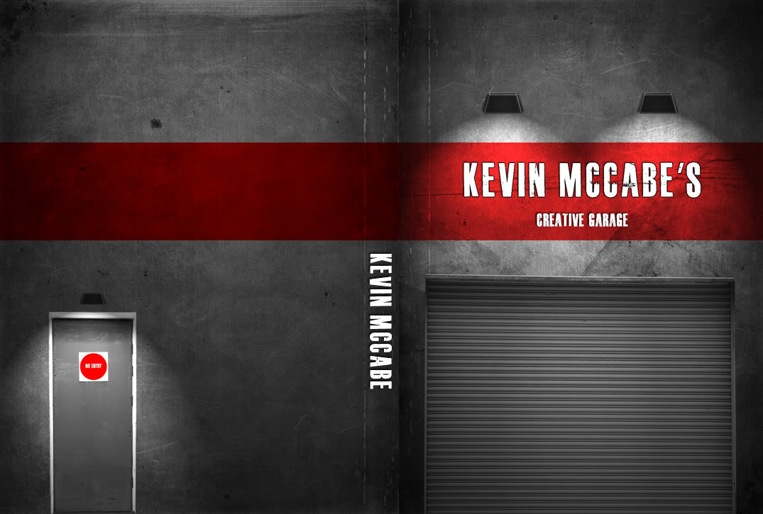
I have to turn in a portfolio for my advertising bullshit tomorrow, and I decided to go the dvd route like I did with my design class. I kept it pretty simple because from the previous examples there wasn't much going on in anyone's designs. Went with a garage theme.

Made this from a few textures, a metal door and garage door image, made the lights from scratch with some lines and brushes. The back is pretty bare but again I don't know if I should put anything on it, there's going to be an info card inside the case that tells what's on the DVD, and the DVD has all of the work on it. I'll probably end up using this as the portfolio housing for all of my creative stuff and not just ads. My laptop wants to kill itself because I've been photoshopping **** since 1100 and I still have 5 ads to make and got to get all of this stuff printed and finalized by 230.
Name:  test5.jpg
Views: 63
Size:  123.2 KB
 
  #2  
Old 04-28-2010 | 09:31 PM
08mustang_gt's Avatar
Senior Member
Joined: Sep 2008
Posts: 2,201
From: Liberty, Missouri
Default

Nice! I like the bareness!

Maybe put a ghosted image of the stang? Thats all the creativity I got lol...
 
  #3  
Old 04-28-2010 | 09:33 PM
Deathdiesel's Avatar
Bored...
Joined: Nov 2008
Posts: 2,500
From: Texas, Gatesville
Default

Looks good, just doesnt scream creativity.
 
  #4  
Old 04-28-2010 | 09:37 PM
PColav6's Avatar
Thread Starter
|
FYL.
Joined: May 2006
Posts: 7,493
From: Pensacola, Florida
Default

Originally Posted by 08mustang_gt
Nice! I like the bareness!

Maybe put a ghosted image of the stang? Thats all the creativity I got lol...
I was thinking of putting some gravity image of a mustang on the back wall but I'm 50/50 on doing that.


Originally Posted by Deathdiesel
Looks good, just doesnt scream creativity.
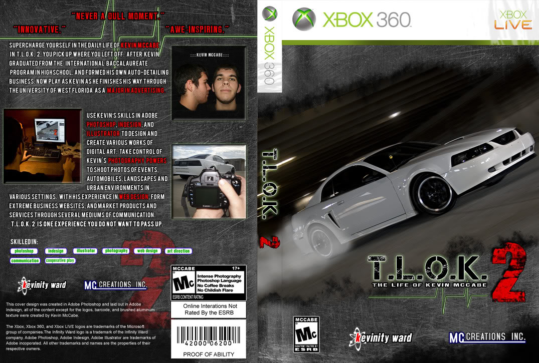
Yeah, it's not exactly as 'loud' as my design resumé, but some of the other people's portfolios were simply a 3 ring binder with a 8.5x11 paper in the slip cover with some abstract art and their name on it. lol.

This would not work for an ad portfolio;
Name:  gamefinal.jpg
Views: 42
Size:  239.4 KB

haha.
 
  #5  
Old 04-28-2010 | 09:40 PM
08mustang_gt's Avatar
Senior Member
Joined: Sep 2008
Posts: 2,201
From: Liberty, Missouri
Default

Hahaha. I still think that is the greatest Xbox game ever...
 
  #6  
Old 04-28-2010 | 09:44 PM
Deathdiesel's Avatar
Bored...
Joined: Nov 2008
Posts: 2,500
From: Texas, Gatesville
Default

It does actually look very good and clean as a game...
 
  #7  
Old 04-28-2010 | 09:47 PM
Must See's Avatar
8-2=6
Joined: Dec 2005
Posts: 3,196
From: Houston,TX
Default

Im digging it. Needs a little something more.

Maybe add some smoke....
 
  #8  
Old 04-28-2010 | 10:01 PM
MustangGTman's Avatar
All Charged Up
Joined: Jun 2005
Posts: 343
From: North Augusta ,South Carolina
Default

Id play that game hahaha. Looks good Kevin.
 
  #9  
Old 04-28-2010 | 10:16 PM
WNRacing's Avatar
KWITCHERBITCHIN
Joined: Sep 2007
Posts: 6,024
From: Gallatin, TN
Default

I'm diggin' it Kevin. Simple is good.
 
  #10  
Old 04-29-2010 | 05:27 AM
shad0ws's Avatar
I like to whine...
Joined: Aug 2005
Posts: 1,640
Default

Looks good man but I agree with some people it doesn't need something. Maybe a drum barrel beside the no exit door with a fire going on inside of it. Not too much but just a little something set off that bare spot.
 
  #11  
Old 04-29-2010 | 12:42 PM
PColav6's Avatar
Thread Starter
|
FYL.
Joined: May 2006
Posts: 7,493
From: Pensacola, Florida
Default

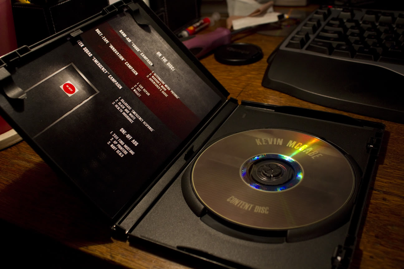
Here's the inside

Name:  portfolio2.jpg
Views: 38
Size:  146.0 KB

Gotta go present/turn it in today, nervous as ****. I hope we don't have to go through all of our ads because I don't want to get torn apart, haha.
 
  #12  
Old 04-29-2010 | 12:56 PM
Lazerred6's Avatar
Pocket Rocket
Joined: Jan 2008
Posts: 3,791
From: Grand Rapids MI
Default

Put your initials in some graffiti on the wall
 
  #13  
Old 04-29-2010 | 01:57 PM
08mustang_gt's Avatar
Senior Member
Joined: Sep 2008
Posts: 2,201
From: Liberty, Missouri
Default

Originally Posted by Lazerred6
Put your initials in some graffiti on the wall
AHH! That would've been cool.

But it looks good mang! Don't be nervous. Rock that ****.
 
Related Topics
Thread
Thread Starter
Forum
Replies
Last Post
shad0ws
Pictures
5
07-18-2006 06:23 AM


All times are GMT -7. The time now is 03:30 AM.