The Lounge This is the General Talk forum.

Restaurant Menu

Thread Tools
 
Search this Thread
 
  #1  
Old 11-18-2009 | 01:35 PM
PColav6's Avatar
Thread Starter
|
FYL.
Joined: May 2006
Posts: 7,493
From: Pensacola, Florida
Default Restaurant Menu

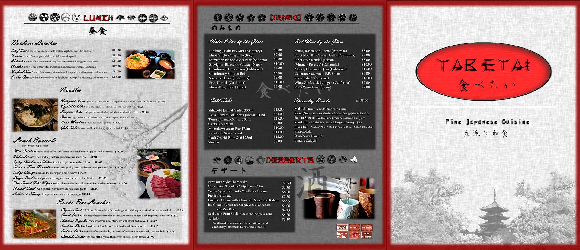
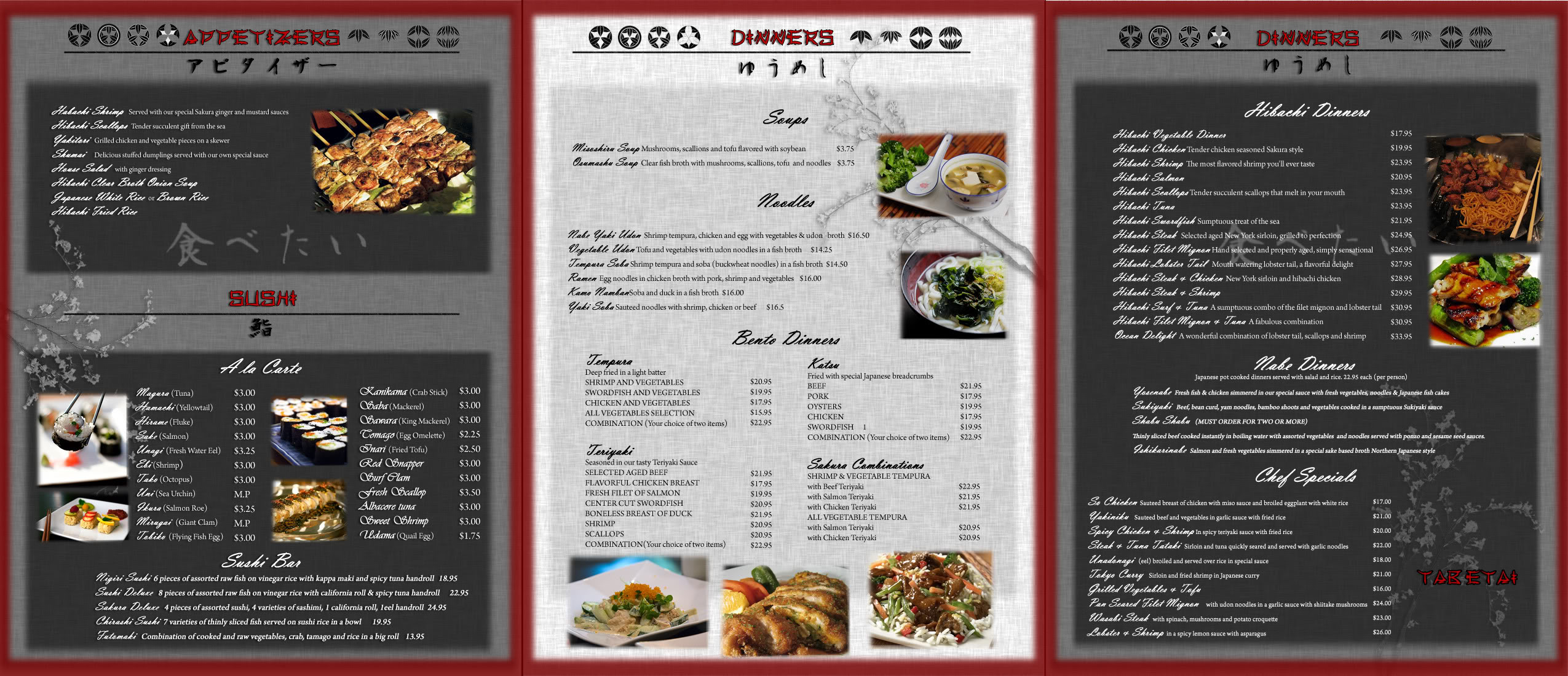
Another publication design class piece...had to make a menu for a fancy japanese restaurant. I've never been to a fancy japanese restaurant or a japanese restaurant in general so I was shooting blind. Did the whole thing in 6 hours so they are some mistakes, had to rush to get it to print ($30 oh my ******* god) and get to class. I could have done much better, personally. But I think I got an A so that's what counts..hahah

The right is the cover, middle is the back cover, left is a flap that folders under the cover

And this is the inside of the menu
Name:  side2copy.jpg
Views: 78
Size:  659.7 KB
To the left would be the inside of the front cover, middle is inside of back, right is inside of flap.
 
  #2  
Old 11-18-2009 | 01:54 PM
Wombozi17's Avatar
Senior Member
Joined: Oct 2007
Posts: 1,220
From: Lake in the Hills, IL
Default

Nice nice. Looks pretty good. I am having a hard time reading the "Fancy" italicized text though. I like how the text looks like handwriting, but it isnt very easy on the eye, I think.

I criticize, but it is very good work! Keep it up Kevin.
 
  #3  
Old 11-18-2009 | 02:09 PM
PColav6's Avatar
Thread Starter
|
FYL.
Joined: May 2006
Posts: 7,493
From: Pensacola, Florida
Default

I agree, the font is way too hard to read and I should have made it bigger so it wasn't so compressed looking, but in my rush I didn't think to go change it.
 
  #4  
Old 11-18-2009 | 02:31 PM
JackThe Ripper's Avatar
Ketchum & Killem
Joined: Sep 2007
Posts: 12,065
Default

Lol.. thats ****** awesome man! Well done!!!!!!!!
 
  #5  
Old 11-18-2009 | 03:35 PM
00blkstanggt's Avatar
Hot, Nasty, Bad ass speed
Joined: Aug 2005
Posts: 3,719
From: Livermore, Ca
Default

Looks good man. Nice to see most of the wines are from Cali. haha
 
  #6  
Old 11-18-2009 | 03:43 PM
TUFF 4.6's Avatar
"Just Add Foot"
Joined: Dec 2007
Posts: 2,250
From: Richmond Va.
Default

Hey Kevin, it looks great! I have just one thought, how hard would this be to read in low light or is that even a concern with this project?
 
  #7  
Old 11-18-2009 | 05:39 PM
probiker427's Avatar
Senior Member
Joined: Mar 2009
Posts: 1,062
From: Mahwah, NJ
Default

damn man, you try selling that design to a real Japanese restaraunt haha, i bet you could easily do it.
 
  #8  
Old 11-18-2009 | 08:05 PM
whitestang04's Avatar
Senior Member
Joined: Apr 2008
Posts: 1,381
From: Sarasota, FL
Default

That looks great Kevin! How long did it take you?
 
  #9  
Old 11-18-2009 | 08:32 PM
mustangvsix's Avatar
4 point 6
Joined: Sep 2005
Posts: 3,347
From: Flagstaff, Az / Los Alamos, NM
Default

that menu is better than any I have ever seen in a Japanese restaurant. Only downside as you have acknowledged is the fancy italicized text but otherwise awesome job!
 
  #10  
Old 11-18-2009 | 09:06 PM
usaf88's Avatar
850 ALL DAY!
Joined: Apr 2009
Posts: 223
From: Navarre
Default

Thank man. Now my wife wants Japanese.

Looks awesome dude. I'd eat there
 
  #11  
Old 11-18-2009 | 10:09 PM
PColav6's Avatar
Thread Starter
|
FYL.
Joined: May 2006
Posts: 7,493
From: Pensacola, Florida
Default

Thanks guys, appreciate it.

Tuff, we didn't have to consider lighting conditions, but when I printed it the text contrasted highly against the backgrounds (the dark gray boxes printed as black ), but it made it easier to read I guess.

Whitstng, I started last night at about 9, worked till 3. Woke up at 730 this morning and finished it at 1130am. So..a while, haha.
 
  #12  
Old 11-18-2009 | 10:34 PM
NeedACobra's Avatar
What is best in life?
Joined: Jul 2007
Posts: 1,117
From: Gulf Breeze, Florida.
Default

You spelled SAKE wrong. But overall its good stuff. And you got an A, so thats all that matters.
 
  #13  
Old 11-18-2009 | 10:40 PM
PColav6's Avatar
Thread Starter
|
FYL.
Joined: May 2006
Posts: 7,493
From: Pensacola, Florida
Default

Saké is definitely spelled right...lopl
 
  #14  
Old 11-19-2009 | 12:12 AM
rebelyell's Avatar
More Cowbell
Joined: Oct 2004
Posts: 3,003
From: North Carolina
Default

Very impressive, good work, But yes the font should be more user friendly..
 
  #15  
Old 11-19-2009 | 12:10 PM
NeedACobra's Avatar
What is best in life?
Joined: Jul 2007
Posts: 1,117
From: Gulf Breeze, Florida.
Default

Ohhh. Haha. I see it now. Its that damn font...lol.
 
  #16  
Old 11-19-2009 | 12:55 PM
Lazerred6's Avatar
Pocket Rocket
Joined: Jan 2008
Posts: 3,791
From: Grand Rapids MI
Default

I want some sushi so bad right now...... Seriously I will kill a bitch for some sushi
 
  #17  
Old 11-19-2009 | 10:24 PM
NeedACobra's Avatar
What is best in life?
Joined: Jul 2007
Posts: 1,117
From: Gulf Breeze, Florida.
Default

I had 2 spicy tuna rolls last night, and 2 unagi rolls last night.
I eat sushi probably alot more than I should. I think Im addicted to it.
 
Related Topics
Thread
Thread Starter
Forum
Replies
Last Post
dsdaddy
The Lounge
14
01-26-2006 02:22 PM


All times are GMT -7. The time now is 11:39 PM.