T Shirt Idea
#91
 03-16-2006, 07:36 AM


Jack Touched Me...I Cried
Join Date: Aug 2005
Location: Tallahassee, FL/ Gaithersburg, MD
Posts: 3,751
Originally Posted by MTShambles
Im fine with shirts, HOWEVER;
MustangTuning is working on getting our own shirts made (still working on the designs after HOW many months now?!). I think were just about ready to have them sent off to be made. If you are going to make shirts, go for something that is more related to Mustang Boards, rather than Mustang Tuning.
If you're looking for a good tagline, you could do this:
Mustang Boards : Powered by MustangTuning.


#95
03-16-2006, 08:03 AM

Originally Posted by Grimmz
I like that slogan, hmmmm Neone wana vote for the Pony on the front and That slogan on the back with the charity's name...
#96
03-16-2006, 08:25 AM

Originally Posted by whitethunder46
I like that idea too, and I still like Springs idea with this font, color, everything....


#102
03-16-2006, 09:23 AM

I like that one, but I have one thing I'd like to see just to see how it would look.
Instead of having just the outline of the pony, put a full detail pony in it and have it kindof fade out into the outlined one...Kindof like 5-6 ponies stacked into a fade (kindof hard to explain what I am talking about here)..
Instead of having just the outline of the pony, put a full detail pony in it and have it kindof fade out into the outlined one...Kindof like 5-6 ponies stacked into a fade (kindof hard to explain what I am talking about here)..


#105
03-16-2006, 09:53 AM

Thats great its simple and generic and can be put on grey or white shirts probably black if you swap the color on the letters.
Can we see one on black?
Also is there a image you can put on the back or something?
Can we see one on black?
Also is there a image you can put on the back or something?


#111
03-16-2006, 10:38 AM
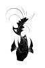
Ok I changed the horse for the possible back image for the shirt. I think I dig this horse much better than the one above that is in the black background. So here is what we have so far with the front and back.
BACK:

FRONT:

BACK:
FRONT:
#112
03-16-2006, 10:44 AM
Originally Posted by MahnotinkneeGT
Ok I changed the horse for the possible back image for the shirt. I think I dig this horse much better than the one above that is in the black background. So here is what we have so far with the front and back.
BACK:
FRONT:
BACK:
FRONT:
make a black version too
#114
03-16-2006, 10:54 AM
Yea, just the pony in the front, i would like to see it a little more tho. Either not just the outline, or a little more outline.
Also, where was the idea of the charity logo on here or something
Also, where was the idea of the charity logo on here or something
#115
03-16-2006, 11:03 AM
Originally Posted by MahnotinkneeGT


hahaha, we have so many opinions on these shirts, every one has different tastes. i dont like the horse on front, i think it should be on back. i think it should only say mustangboards on the front. i like the red on black that you posted.
 Print it!
#117
03-16-2006, 11:12 AM
Yeah yall are some picky mutherfckers. I swear..If it was in the store I am sure you wouldn't say "ooh I'm not gonna buy that because it says mustangboards.com really small on the front"
If we are going to do this, we need to reach a happy medium and not nitpick the crap out of it. You are gonna want something someone else doesnt and they are gonna want something you dont...remember...if it is decided to use whatever I design...I am doing this for free.
Everyones input is welcome but let's not get out of control with little things. It is for charity remember and not just for our benifit.
That was not meant to read that I was pissed off or ranting. Just mentioning a few things..carry on haha
#119
03-16-2006, 11:33 AM
Jack Touched Me...I Cried
Join Date: Aug 2005
Location: Tallahassee, FL/ Gaithersburg, MD
Posts: 3,751
I like the shirt, but how would u make a black one...Black just doesn't get dirty as fast and is more slimming to my figure...Lol...
But seriously, I like the latest shirt idea, if we could get one in white and black and add the Charity logo...i think it would be nice...
But seriously, I like the latest shirt idea, if we could get one in white and black and add the Charity logo...i think it would be nice...
