
Finally!!! Let me know what you think...

Thread Starter
|
Always Detailin'
Joined: Oct 2005
Posts: 3,556
From: Dayton, OH
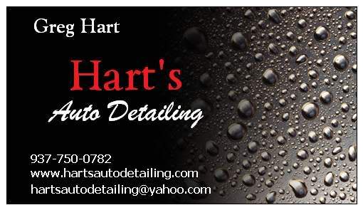
A friend and I finally designed a logo for my detailing business. It's been months since I've started the idea of a design, and with many people helping, we finally knocked it down.
I'll be using it on flyers, website, vinyl window decals, etc. etc.
Please be critical and let me know what you think, if anything should be altered or changed.

I'll be using it on flyers, website, vinyl window decals, etc. etc.
Please be critical and let me know what you think, if anything should be altered or changed.


Senior Member
Joined: Dec 2005
Posts: 544
From: Springfield, VA
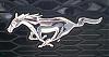
Don't get me wrong. I like the one you have come with. It is very clean. It is very simple. It is very straightforward. To my own personal tastes though, I'd lose the oval.
BTW, good luck with the business.


Administrator
Joined: Sep 2004
Posts: 6,613
Well as a Marketing Manager for a Fortune 500 company, I may know something (lol).
Anyway, if your name is Hart why not play on the "Heart" theme??? Instead of an oval, use a Heart shape. Make the connection between how your are gonna "love" their cars as much as the owners do. You could have a lot of fun with this if you pull it off the right way.
Anyway, if your name is Hart why not play on the "Heart" theme??? Instead of an oval, use a Heart shape. Make the connection between how your are gonna "love" their cars as much as the owners do. You could have a lot of fun with this if you pull it off the right way.

Zig *hearts* Fishy
Joined: Jun 2005
Posts: 2,444
From: Pensacola, Florida
Well as a Marketing Manager for a Fortune 500 company, I may know something (lol).
Anyway, if your name is Hart why not play on the "Heart" theme??? Instead of an oval, use a Heart shape. Make the connection between how your are gonna "love" their cars as much as the owners do. You could have a lot of fun with this if you pull it off the right way.
Anyway, if your name is Hart why not play on the "Heart" theme??? Instead of an oval, use a Heart shape. Make the connection between how your are gonna "love" their cars as much as the owners do. You could have a lot of fun with this if you pull it off the right way.
Thread Starter
|
Always Detailin'
Joined: Oct 2005
Posts: 3,556
From: Dayton, OH
I like the idea and concept of the heart, and I might throw a few things together.
I have about 25 days left for my free trial version for photoshop.
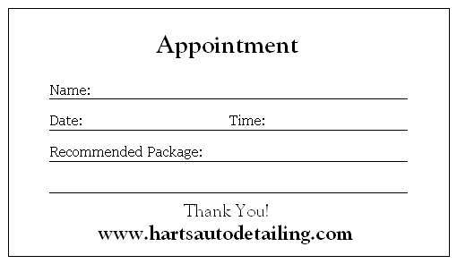
The more I think about it, I think I'm going to go with something very simple. I at least know for sure the fonts I plan on using. I put together a very nice flyer today on Word. I plan on getting some White Gloss flyer paper for the paper.
I have about 25 days left for my free trial version for photoshop.
The more I think about it, I think I'm going to go with something very simple. I at least know for sure the fonts I plan on using. I put together a very nice flyer today on Word. I plan on getting some White Gloss flyer paper for the paper.
Thread Starter
|
Always Detailin'
Joined: Oct 2005
Posts: 3,556
From: Dayton, OH
Too bad you weren't closer to Dayton!!! If for some reason you ever head down this way, let me know, I'll still hook you for a fellow board member/mustang owner!
Administrator
Joined: Sep 2004
Posts: 6,613
****....that is awesome! That is pretty much just what I would have had in mind. Why did nobody like this?

BMC Member# 03209
Joined: Jan 2005
Posts: 1,735
From: north ridgeville, ohio
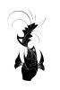
O and i dig the logo slither made, it catches the eye and still looks classy
Zig *hearts* Fishy
Joined: Jun 2005
Posts: 2,444
From: Pensacola, Florida
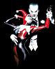
I think he/they wanted to see something a little more edgier and new age looking. Wanted to see a different type car on there, etc. But what do I know..I am just a graphic designer lol


Thread Starter
|
Always Detailin'
Joined: Oct 2005
Posts: 3,556
From: Dayton, OH
the one Slither made is way too cartoony, large, can not minimize it and still have it look good with details. I want simple. Think of any well known, successful business and their logo's are simple and to the point.
I don't want people to look at a logo and remember, O that's the one with the car, or that's the one with many colors, etc. etc.. Someone should be able to look at a logo and remember the name, not the stuff around it.
I don't want people to look at a logo and remember, O that's the one with the car, or that's the one with many colors, etc. etc.. Someone should be able to look at a logo and remember the name, not the stuff around it.
Zig *hearts* Fishy
Joined: Jun 2005
Posts: 2,444
From: Pensacola, Florida
the one Slither made is way too cartoony, large, can not minimize it and still have it look good with details. I want simple. Think of any well known, successful business and their logo's are simple and to the point.
I don't want people to look at a logo and remember, O that's the one with the car, or that's the one with many colors, etc. etc.. Someone should be able to look at a logo and remember the name, not the stuff around it.
I don't want people to look at a logo and remember, O that's the one with the car, or that's the one with many colors, etc. etc.. Someone should be able to look at a logo and remember the name, not the stuff around it.

Thread Starter
|
Always Detailin'
Joined: Oct 2005
Posts: 3,556
From: Dayton, OH
turn the oval into a heart. Don't make it cartoony. Use effects similar to what WNRacing did with the Oval. Keep my current font's I'm using and similar effects.
Baskerville font for Hart's and Brush Script MT for Auto Detailing. Also only use colors red and black. That's what I want. Any takers?
Baskerville font for Hart's and Brush Script MT for Auto Detailing. Also only use colors red and black. That's what I want. Any takers?